|
Its December, and yes I'm writing this in a cozy sweater and slippers, but maybe these cheery floral invitations will cure your Monday blues! Jacqui and Mark are having a soft, romantic wedding with vintage touches including an afternoon tea reception. The soft florals and delicate script of their invitations hint to their guests of a whimsical day to come full of love at the historic Kirlkland House. We perforated the card so the bottom portion of the invitation breaks off into the RSVP card. Clever, and practical! All the best with your upcoming wedding Jacqui and Mark! 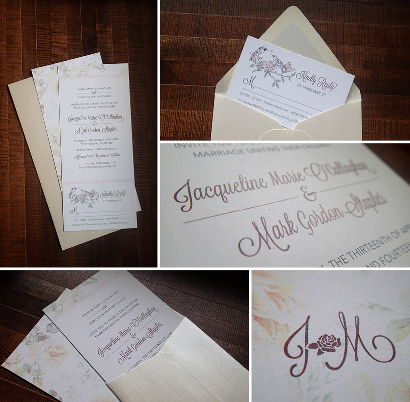
0 Comments
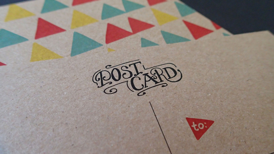
If you are married, you likely have heard of the traditional anniversary gift themes to go by, by year. First is paper, second is cotton, third is leather, and we all hope to get to those 50 "golden" years. Aaron and Deidra celebrated their first wedding anniversary this month. Aaron wanted to surprise Deidra with a beautiful "paper" gift of custom stationery. We were so happy to help out! Going straight to the sketchbook, we created a hand lettered "D" pattern, and an illustrated colourful triangle pattern for her personalized letterhead and fun postcards. Deidra likes lots of colour and funky looking things, she also likes to write letters so, I'd say she's set! Good idea Aaron, and congrats on your first year of marriage! 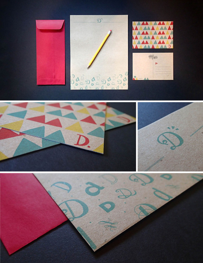
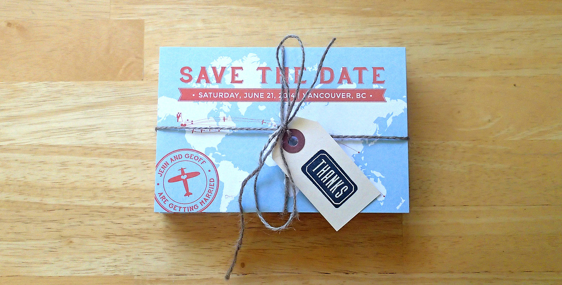 Jenn and Geoff are getting married! Its true, and its exciting. They are a couple who love the outdoors, and love to see the world. Their travels have introduced them to many friends who are coming from long and far to celebrate their Vancouver wedding with them. We created a postcard style save-the-date, complete with a world map outlining the many countries their guests will be travelling from. Pretty spiffy. Happy wedding planning Jenn & Geoff! 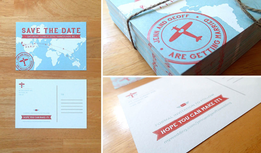 
The LogoIf you're a cat person, you'll likely be familiar with the Russian Blue breed. Russian Blue cats are short-haired, and blue-gray in colour. What usually sets them apart from some similar breeds are their green eyes. Yes... I've been learning about cats. Nadine Velten breeds these fuzzy felines, and loves it. She wanted to bring some extra professionalism to her breeding business by branding Dymka Blue Cattery, and we did just that. The icon is more than a little cat staring off into the distance with its back to you, it is also a "D" and a "B" for Dymka Blue. Pretty sneaky, but we're really happy with the results. All the best with your kittens Nadine! From the Sketchbook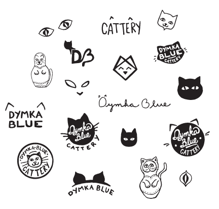
The Servants Anonymous Society (SAS) is a great organization that offers hope, help and a home to women who have been sexually exploited. Next month they are having a large fashion show fundraiser to raise awareness, and funds for these women. Below is the poster we designed for the event. You can learn more about SAS at www.sasurrey.ca. If you would like to purchase a ticket for the event, please email info@sasurrey.ca. Hope to see you there. 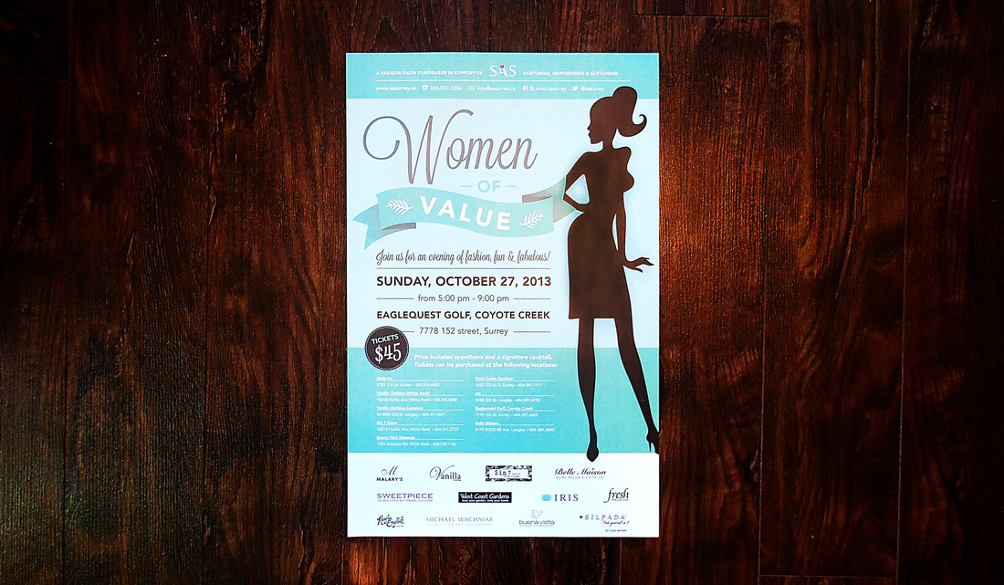
 A huge welcome to Let Them Eat Cakes! A wonderful dessert stand rental service, specially suited for weddings and special events, serving the greater Vancouver area. I have loved working with Sarah and Annette – a mother, daughter duo, to help bring their new business to life. I guess you could say, its a pretty sweet idea. If you are planning a wedding, be sure to work with these ladies for an exquisite looking dessert table! The Logo With its hand-lettered charm, the Let Them Eat Cakes text stands tall, representing a three layer cake. The text rests on a cake stand much like you will find in the Let Them Eat Cakes collection. 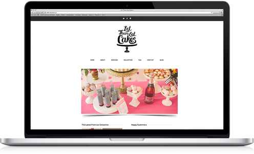 The Website (eatcakes.ca) Clean, simple and easy to navigate, the Let Them Eat Cakes website is full of everything you need to know about dessert stand rentals. Beautiful photographs by The Nickersons contrast the minimalist layout and bring the site to life. Be sure to read the Let Them Eat Cakes news by following their blog!  Elements We created a custom illustrated pattern with all things "sweet" in mind. Perfect for use in print, and on the web, like their twitter page background.
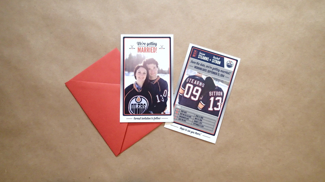
It was so much fun to work with these love birds to create their save-the-dates! With a classic hockey card in mind, we produced these pocket-sized cards with their favourite team to send to their friends and family. Thanks to K&K Photography for the lovely engagement shots we were able to use! All the best with your planning Rachel & Jason! 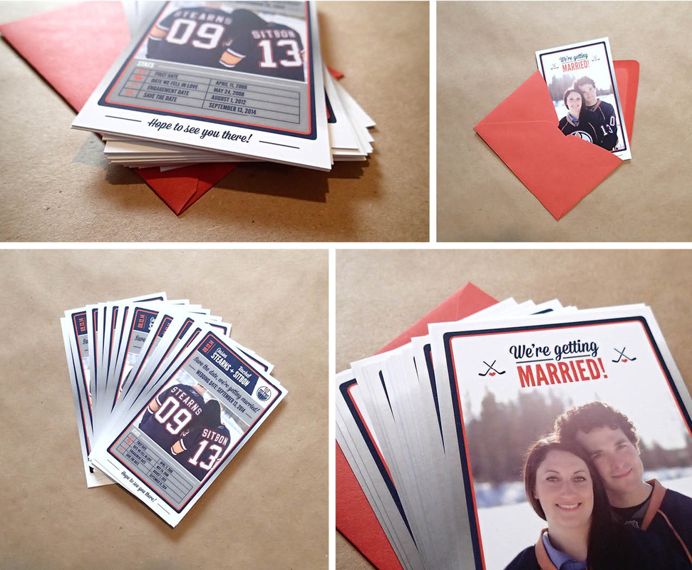
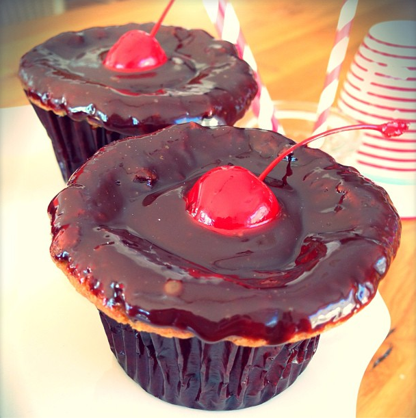
 Tirzah (Tirz) Pfister is a really, really good baker. She lives for it, and you can taste it. She is bringing her passion to life by launching Tirz Bakeshop. Tirzah puts a special touch into every part of her baking – quality ingredients, melt-in-your-mouth taste and exquisite presentation. Tirzah lives in Zurich, Switzerland and we were so happy to be able to work with her while she was visiting Canada. Tirz has an eye for beautiful aesthetics – beyond her sweet creations – which makes her a delight to work with. We explored quite a few different avenues for the Tirz Bakeshop logo brand. It had to be timeless, legible and appeal to a wide range of age groups. Hand lettering was a must, and we decided on a custom hand lettered slab-serif – friendly and not too trendy. We look forward to seeing how her packaging turns out – gold foiling! Yes! From the sketch book... 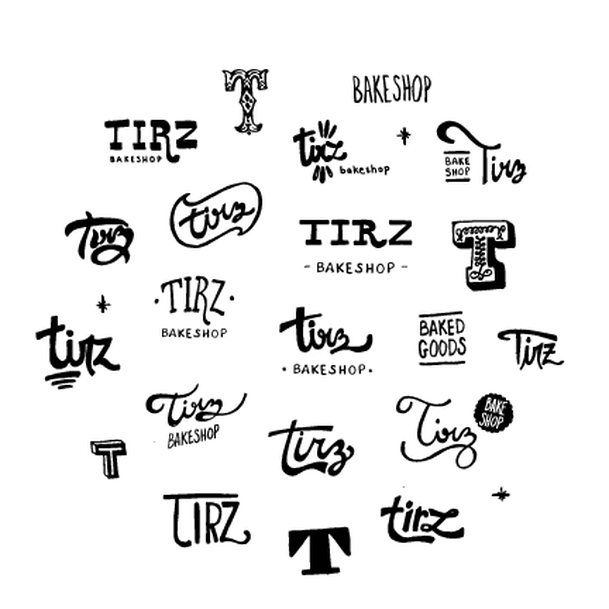 A secondary graphic was created to use as a sub-logo within the brand. We produced a rubber stamp for packaging to give that real made-from-scratch feel. Rubber stamps are... awesome.  Keep up with Tirzah on instagram ( tirzahpfister) to drool over her baked goods!  I worked on a few updates for City Chapel today and thought I should share. I have been so fortunate to work with the lovely folks at City Chapel to develop branding and identity, website design and some other graphics for them. City Chapel is a small (but growing) church in the heart of downtown Red Deer. The are lead by a team of great people who desire to engage in their surrounding culture. The Logo The City Chapel logo is sleek modern and timeless. When beginning sketches, the goal was to involve meaning, without looking stuffy or typical. The mark displays a gathering, or community. It also represents the two C's from City Chapel. The rings of the C's also have twelve sections, representing the twelve disciples – discipleship being a core value of the church. A bold sans-serif typeface was selected for the text to appear strong and current. A bright palette was chosen to get noticed, and display the vibrancy of the church community.  The Website The team at Redpoint Design helped bring this website to life – you can check it out at www.citychapel.ca 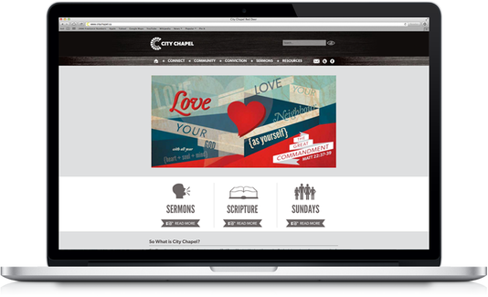 We created big colourful slides for the website outlining the church's main convictions. As a family journeying in faith together, we agree and share that the focus of our ministry is to glorify God through the fulfillment of the Great Commission (Matthew 28:19-20) in the spirit of the Great Commandment (Matthew 22:37–39) because of the Great Exchange (2 Corinthians 5:21). This is fulfilled as disciples of Jesus Christ are made. God is glorified as we manifest His presence in doing so (2 Timothy 2:2; 1 Corinthians 10:31). 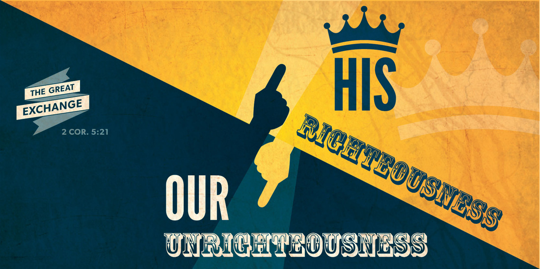 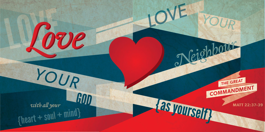 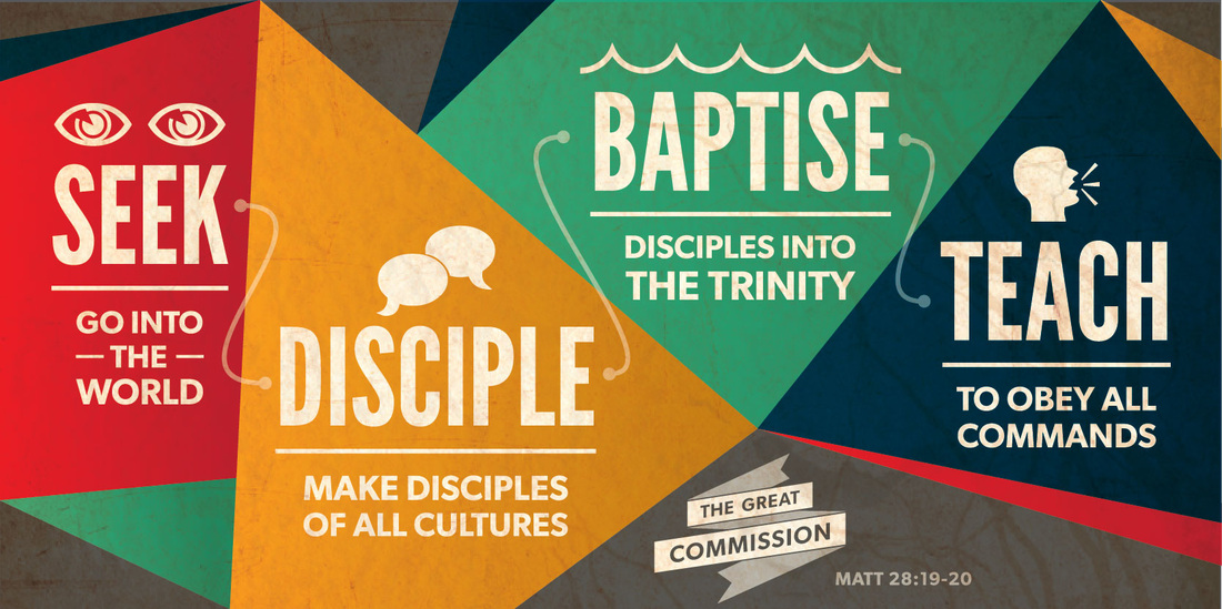 An image for The Gospel of John was created to highlight a series that was going to carry on for over a year.  |
Kayla EnglishHappily married to a handsome fellow named Tylor, she is a graphic designer, paper lover, hobby crafter, culinary adventurer and an all-round creative enthusiast. Archives
July 2014
Categories
All
|


 RSS Feed
