|
Its December, and yes I'm writing this in a cozy sweater and slippers, but maybe these cheery floral invitations will cure your Monday blues! Jacqui and Mark are having a soft, romantic wedding with vintage touches including an afternoon tea reception. The soft florals and delicate script of their invitations hint to their guests of a whimsical day to come full of love at the historic Kirlkland House. We perforated the card so the bottom portion of the invitation breaks off into the RSVP card. Clever, and practical! All the best with your upcoming wedding Jacqui and Mark! 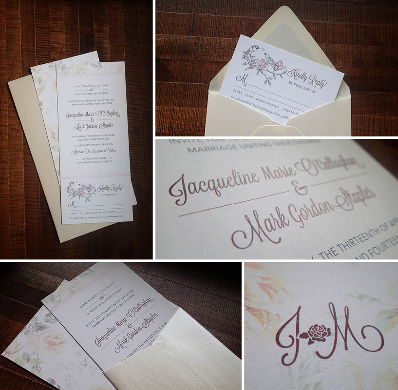
0 Comments
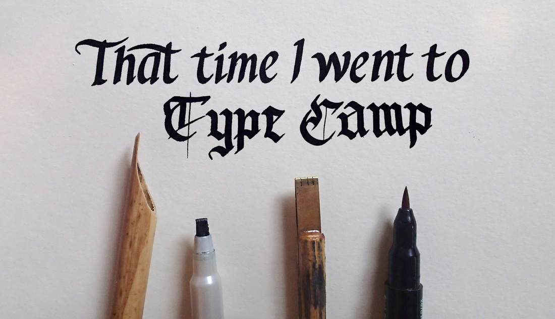
Its not everyday that you get to spend a day in a beautiful studio, surrounded by typography nerds, with paper and ink and glean from some of the best masters of the trade. But I did. Twice. I went to Type Camp, and as a happy Type Camper, I'll give you the inside scoop on why it was so awesome. If you know me at all, you likely know that I spend a lot of time in my sketchbook. Whether it be sketching for a logo, concepting a print layout or doing a quirky illustration, I learn and progress with images. Over the past few years I've been quite keen on drawing and creating letters. I love the rawness of a hand drawn letter, and I love the typographic possibilities that can be created with ink on paper. I've always been known to have 'neat and tidy' writing. I was quite prideful of it as a kid (though I would never show it) and was always the one asked to write assignments on the board for the class. My writing style is constantly evolving, and I found myself longing for some practical instruction to use the funny looking calligraphy pens that I have had laying around, but have never really known how to use. I needed to know more about calligraphy, I needed to learn the basics. Two days before Type Camp in Vancouver was to begin, I stumbled on the website, my heart raced, and felt like this was something that needed to happen. I took my rural girl bum into Gastown for two Saturdays of type nerd bliss. Held in the gloriously lit creative loft of the John Fluevog shop, I learned how to properly hold a calligraphy pen, and went nuts with letters and ink. We even learned to "flourish" letters with brush pens... can you believe it? So great. It was so cool to be in an environment with others who had similar interests and got excited about the creative possibilities of the descender of a lowercase 'y'. We had three instructors, Shelly Gruendler, Laura Worthington and Martin Jackson. They're legit, look them up. I'm so grateful for the skills that I've learned and really hope to attend another Type Camp. Ireland 2014? A girl can dream. 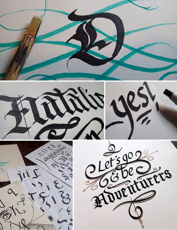
 November. The month when you plan to be extra organized and begin your Christmas to-do list early, in hopes of avoiding a freak out in December. Can we help? We've illustrated six postcard designs for this Christmas season. You can give them as gifts, frame them as prints, pop them in the mail or attach one to your homemade fruit cake at your first holiday gathering. The best part is, you choose them, and we'll send them right to your house. Browse the collection by clicking the link below or the "Christmas" tab in the top navigation. Happy early Christmas planning everyone! 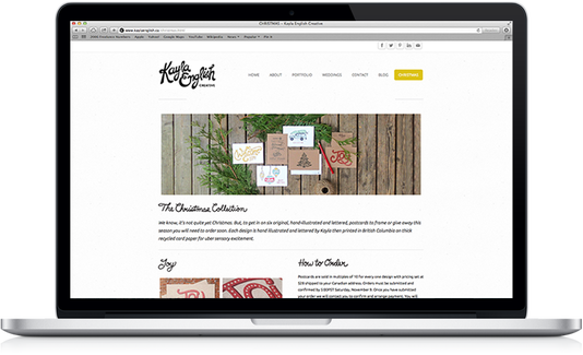
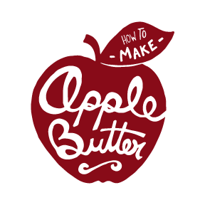
 Tis the season to stock up on all the goodness that autumn has to offer. The other day I bought a 10 pound bag of BC apples for $5.00. I love farmers markets. My husband suggested I try making apple butter. I did, and it turned out great. So great on home made toast or on a cracker with some soft cheese. Have a go, and let me know how yours turns out!
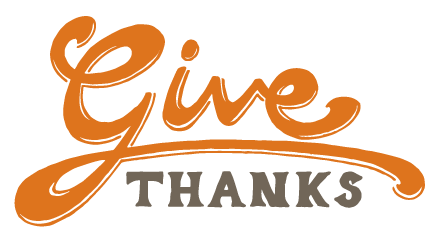
 Hey guys. Happy Thanksgiving! I really like this time of year... leaves, pumpkins, cozyness and turkey dinner. Its safe to say that I'm really excited to gather with family this weekend. In all cheesiness (but seriousness), I'm most thankful this year for my champion of a husband (and business partner) Tylor, the opportunity to create and illustrate for a living, and calling this beautiful province of B.C. my new home. I'm also thankful for our awesome new clients this year. You guys are the best. Tis the season to give and feel warm & fuzzy, so we are going to give away a Kayla English Creative postcard prize pack (pictured below) to one lucky individual who comments on this blog post. Tell us what you are most thankful for this year, and we will select a winner at random on Tuesday October 15. Good luck! 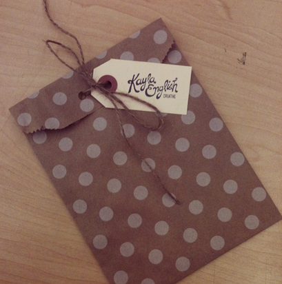

 So I've retired my Birkenstocks for the season. And, I've been reaching to the back of my closet for the sweaters. Yeah, that means autumn is upon us. I'm almost thankful for the cooler temperatures because no warm sunshine outside means a cozy work space with little distraction or desire to go frolic outside. I'm hoping to finally get caught up with work as my mind is always spinning with personal projects and crafts that I would like to eventually get to. So, are you ready for sweater weather? 
Keep your computer looking cozy, and download the "Sweater Weather" desktop wallpaper by clicking right here. :)
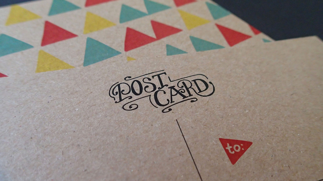
If you are married, you likely have heard of the traditional anniversary gift themes to go by, by year. First is paper, second is cotton, third is leather, and we all hope to get to those 50 "golden" years. Aaron and Deidra celebrated their first wedding anniversary this month. Aaron wanted to surprise Deidra with a beautiful "paper" gift of custom stationery. We were so happy to help out! Going straight to the sketchbook, we created a hand lettered "D" pattern, and an illustrated colourful triangle pattern for her personalized letterhead and fun postcards. Deidra likes lots of colour and funky looking things, she also likes to write letters so, I'd say she's set! Good idea Aaron, and congrats on your first year of marriage! 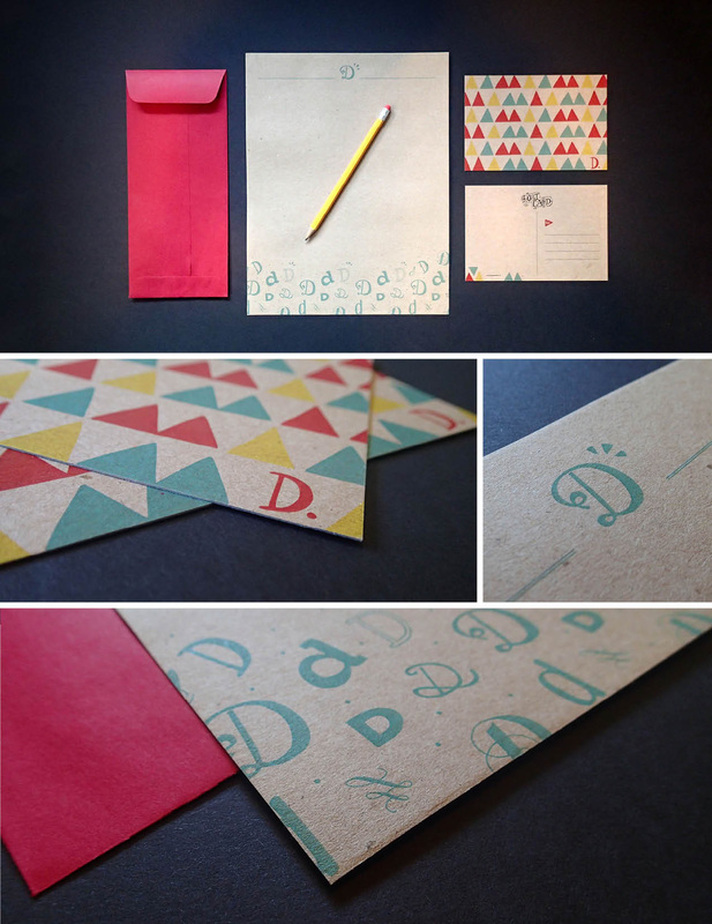
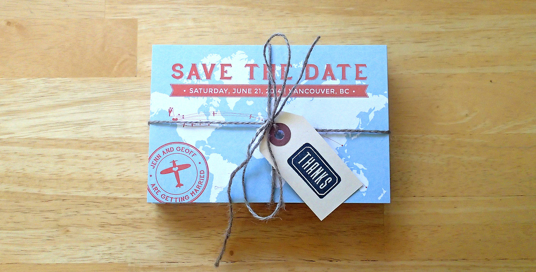 Jenn and Geoff are getting married! Its true, and its exciting. They are a couple who love the outdoors, and love to see the world. Their travels have introduced them to many friends who are coming from long and far to celebrate their Vancouver wedding with them. We created a postcard style save-the-date, complete with a world map outlining the many countries their guests will be travelling from. Pretty spiffy. Happy wedding planning Jenn & Geoff! 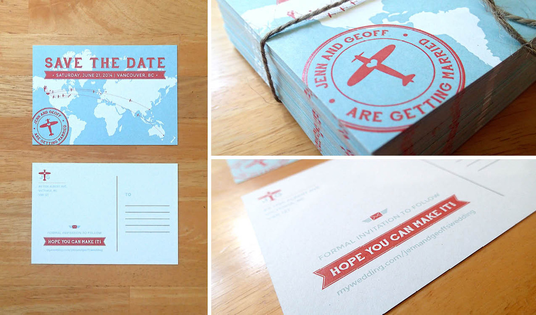 
The LogoIf you're a cat person, you'll likely be familiar with the Russian Blue breed. Russian Blue cats are short-haired, and blue-gray in colour. What usually sets them apart from some similar breeds are their green eyes. Yes... I've been learning about cats. Nadine Velten breeds these fuzzy felines, and loves it. She wanted to bring some extra professionalism to her breeding business by branding Dymka Blue Cattery, and we did just that. The icon is more than a little cat staring off into the distance with its back to you, it is also a "D" and a "B" for Dymka Blue. Pretty sneaky, but we're really happy with the results. All the best with your kittens Nadine! From the Sketchbook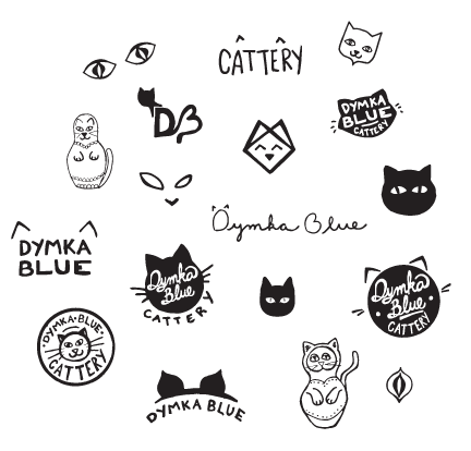
The Servants Anonymous Society (SAS) is a great organization that offers hope, help and a home to women who have been sexually exploited. Next month they are having a large fashion show fundraiser to raise awareness, and funds for these women. Below is the poster we designed for the event. You can learn more about SAS at www.sasurrey.ca. If you would like to purchase a ticket for the event, please email info@sasurrey.ca. Hope to see you there. 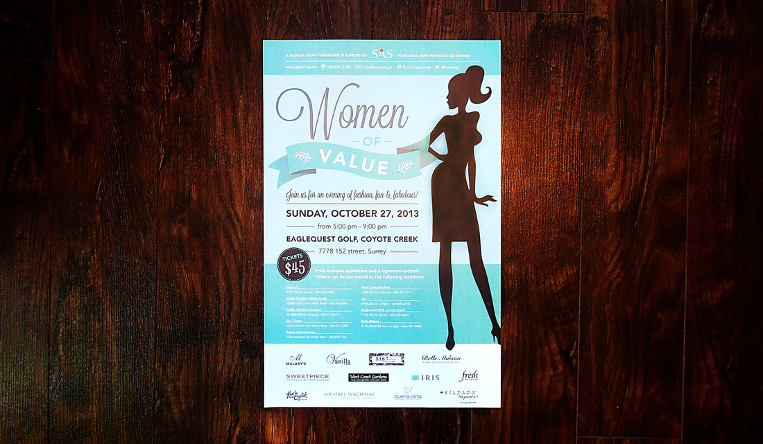
|
Kayla EnglishHappily married to a handsome fellow named Tylor, she is a graphic designer, paper lover, hobby crafter, culinary adventurer and an all-round creative enthusiast. Archives
July 2014
Categories
All
|
 RSS Feed
