 I worked on a few updates for City Chapel today and thought I should share. I have been so fortunate to work with the lovely folks at City Chapel to develop branding and identity, website design and some other graphics for them. City Chapel is a small (but growing) church in the heart of downtown Red Deer. The are lead by a team of great people who desire to engage in their surrounding culture. The Logo The City Chapel logo is sleek modern and timeless. When beginning sketches, the goal was to involve meaning, without looking stuffy or typical. The mark displays a gathering, or community. It also represents the two C's from City Chapel. The rings of the C's also have twelve sections, representing the twelve disciples – discipleship being a core value of the church. A bold sans-serif typeface was selected for the text to appear strong and current. A bright palette was chosen to get noticed, and display the vibrancy of the church community.  The Website The team at Redpoint Design helped bring this website to life – you can check it out at www.citychapel.ca 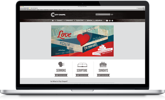 We created big colourful slides for the website outlining the church's main convictions. As a family journeying in faith together, we agree and share that the focus of our ministry is to glorify God through the fulfillment of the Great Commission (Matthew 28:19-20) in the spirit of the Great Commandment (Matthew 22:37–39) because of the Great Exchange (2 Corinthians 5:21). This is fulfilled as disciples of Jesus Christ are made. God is glorified as we manifest His presence in doing so (2 Timothy 2:2; 1 Corinthians 10:31). 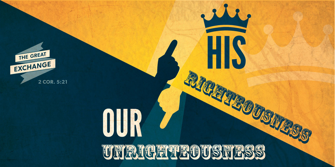 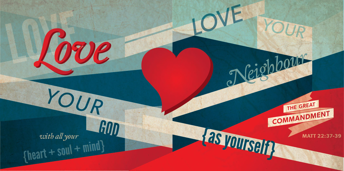 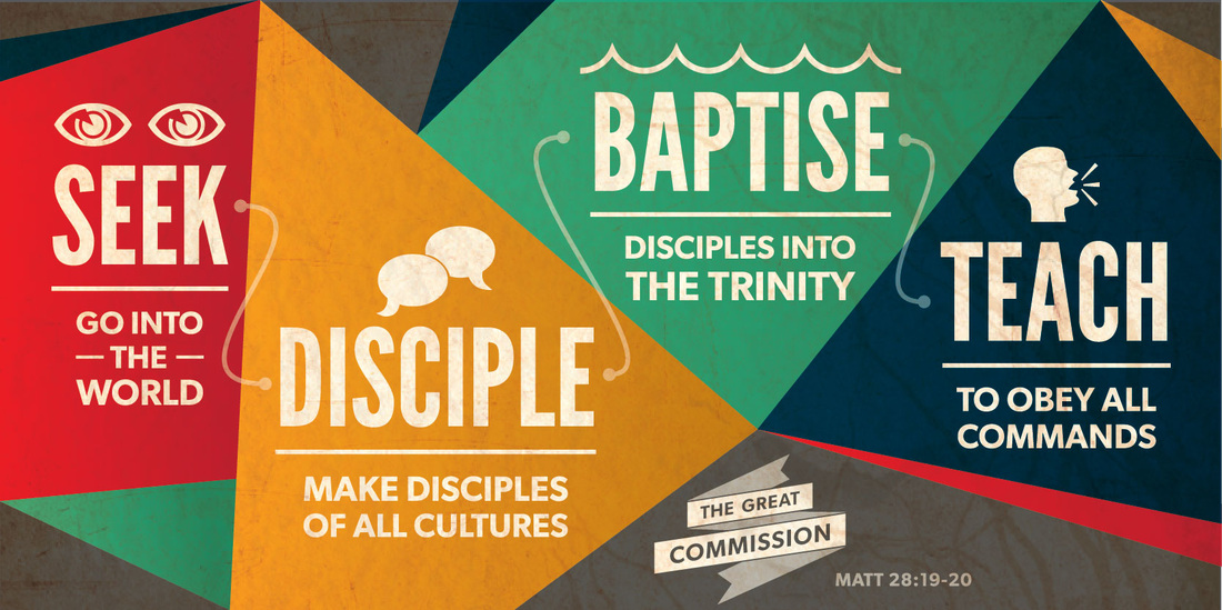 An image for The Gospel of John was created to highlight a series that was going to carry on for over a year. 
0 Comments
Leave a Reply. |
Kayla EnglishHappily married to a handsome fellow named Tylor, she is a graphic designer, paper lover, hobby crafter, culinary adventurer and an all-round creative enthusiast. Archives
July 2014
Categories
All
|
 RSS Feed
